Using Plots to Create What-If Scenarios
You can visually display the results of a what-if scenario in the Query Manager of the Data Manager task.
Note that plots are always drawn starting from the currently visualized data, according to the filters set, and any other operations performed on the data.
If the data changes, for example because a filter or a formula has changed, the plot is not automatically updated.
Plots are updated by right-clicking the corresponding row in the Plot Manager, and selecting Refresh Rows.
This allows you to perform different operations on the data (such as filters and formulas) and visually display the data before and after the performed operations.
Procedure
Drag and drop an attribute onto the Filter column of the Query Manger.
Configure the filter, which represents your first hypothesis.
Drag and drop the attribute you want to use for the graph onto the required column of the Plot Manager and select a suitable plot.
Modify the results of the filter in the Filter column of the Query Manager, so the filter now represents your second hypothesis.
Drag and drop the same attribute you used in step 3 onto the second row of the Plot Manager and create the same plot you used in step 3. You will now see two plots, representing your two hypotheses, side by side in the Plots tab.
Alternatively you can configure the first plot, and then copy it onto the second row in the Plot Manager (dragging and dropping the attribute, keeping the Ctrl key pressed). Then create the first filter, right-click the first row of the Plot Manager and select Refresh Rows. Then create the second filter, selecting Refresh Rows on the second row.
Example
The following example is based on the Adult dataset.
Scenario data can be found in the Datasets folder in your Rulex installation.
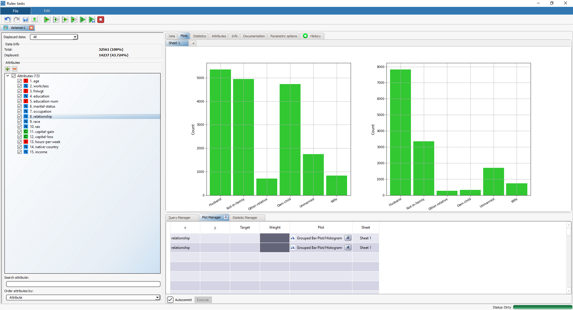
We have applied a filter to the age attribute where age < 40, and built a histogram on the relationship attribute, achieving the first histogram on the left. We then changed the filter condition for the age attribute to age >=40, and built a second histogram with the relationship attribute.
It is now possible to compare the distribution of the relationship attribute in both cases, as displayed below:
