Merging Plots
Some plots of the same type can be displayed together.
To achieve this, you must select two or more cells (corresponding to two or more rows) and then right-clicking on them you can choose the merging options on the menu.
Note that the different merged plots are drawn in different colors, so when merging plots it is not possible to use the Target variable in all the plots where adding the Target generates plots with different colors.
The following plots can be merged:
Bar Plot/Histogram
Boxplot
Area Plot
Curve
Scatter
ROC Curve
Examples
The following examples are based on the Adult dataset.
Scenario data can be found in the Datasets folder in your Rulex installation.
Plot Type | Description | Result |
|---|---|---|
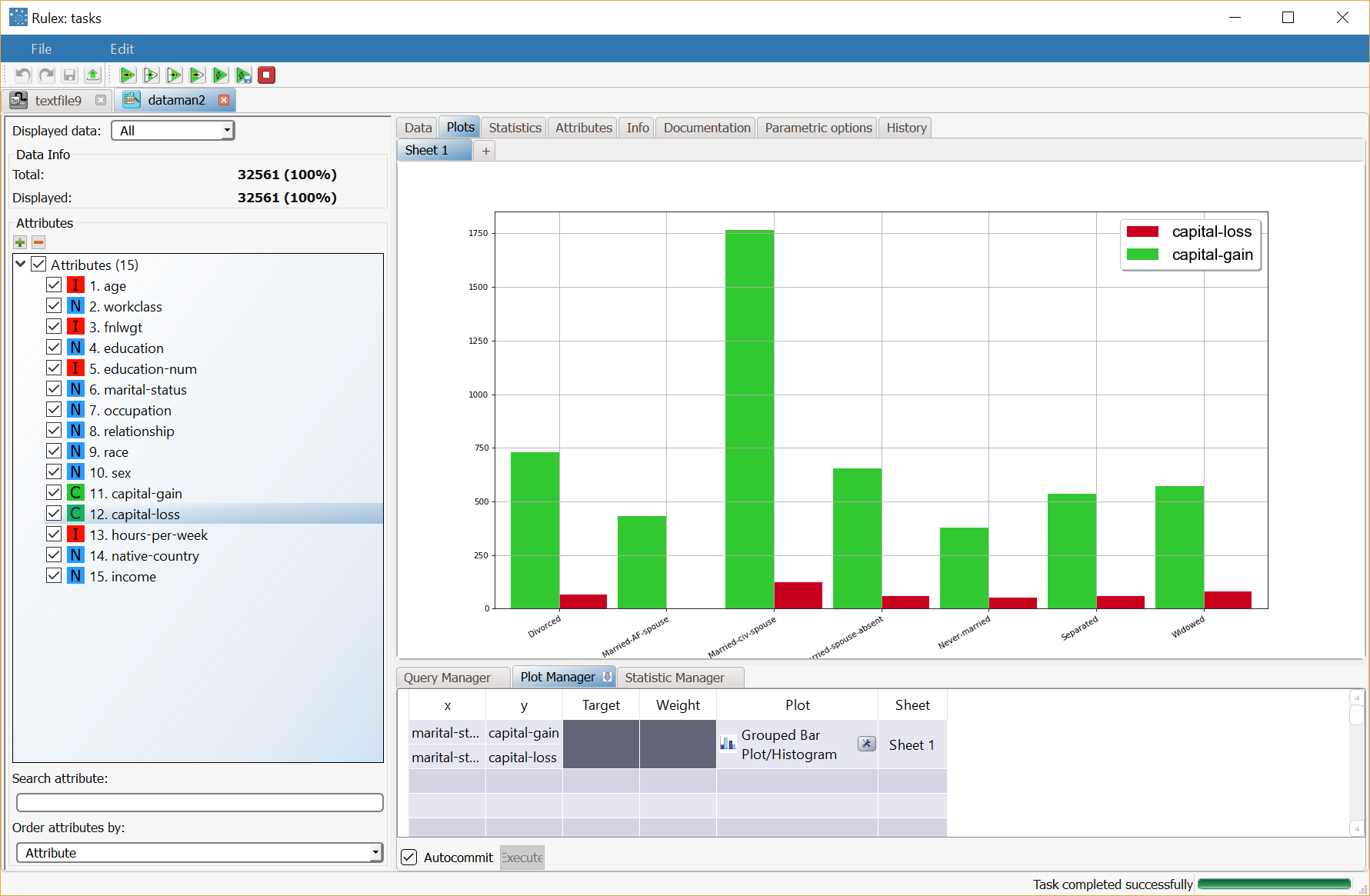
Bar plot | Merging capital-gain and capital-loss bar plots. The plot in the example was created with the marital-status attribute in the x axis and capital-gain and capital-loss in the two y axes, and the plots were merged on a box plot. | |
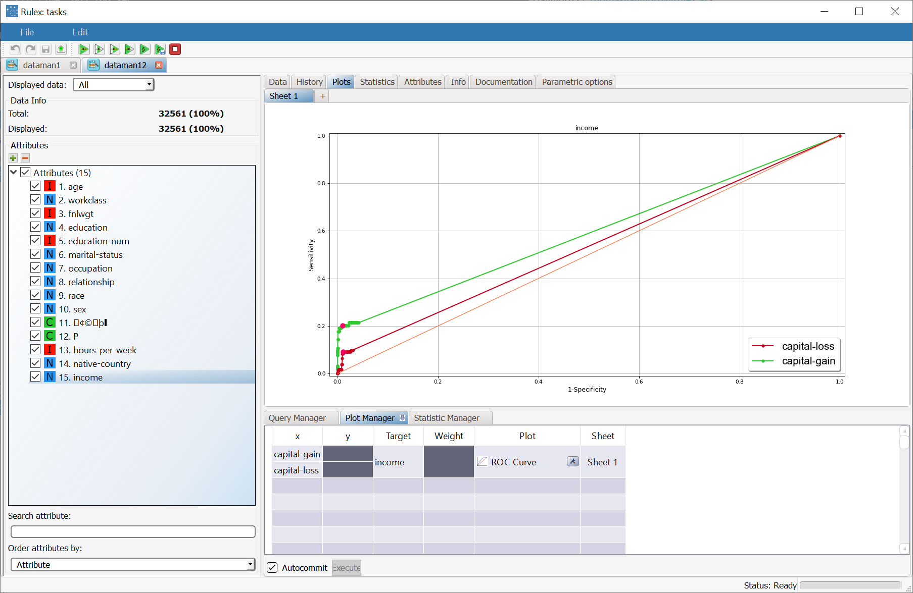
ROC Curve | Merging the ROC Curves capital-gain and capital-loss with income as the Target attribute. | |
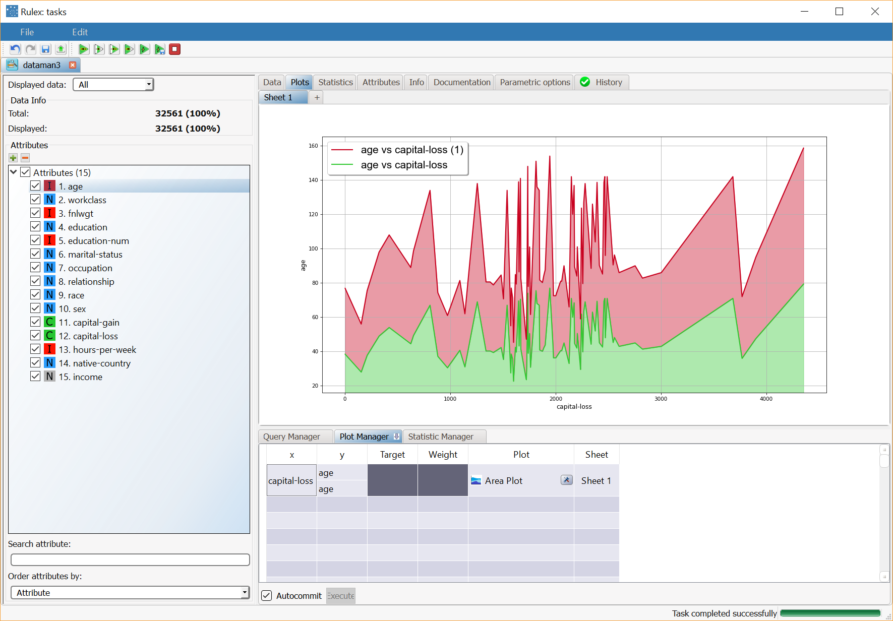
Area plot | Merging two area plots with capital-gain and capital-loss as x column values with age as y column value. Area plots are normally used to compare several attributes, consequently merging different area plots is particularly useful in more advanced comparison operations. |


