Plotting Box Plots
A Box Plot is a graphical representation based on the minimum, first quartile, median, third quartile and maximum value of a quantitative data set.
It contains the following attributes:
Attribute | Mandatory | Constraints |
|---|---|---|
x | Yes | |
target | No | |
weight | No | It cannot be a nominal value |
Properties
Category | Properties | Description |
|---|---|---|
General parameters | Display order | If more than one x attribute is selected (see Merging Plots), you can chose whether to group the display by attributes or targets in the plot. For example if the plot has the attributes |
Weight attribute | Operator | The operator used to aggregate weight attribute values. Possible values are average, maximum, median, minimum, mode or sum. |
Examples
The following examples are based on the Adult dataset.
Scenario data can be found in the Datasets folder in your Rulex installation.
Type | Description | Result |
|---|---|---|
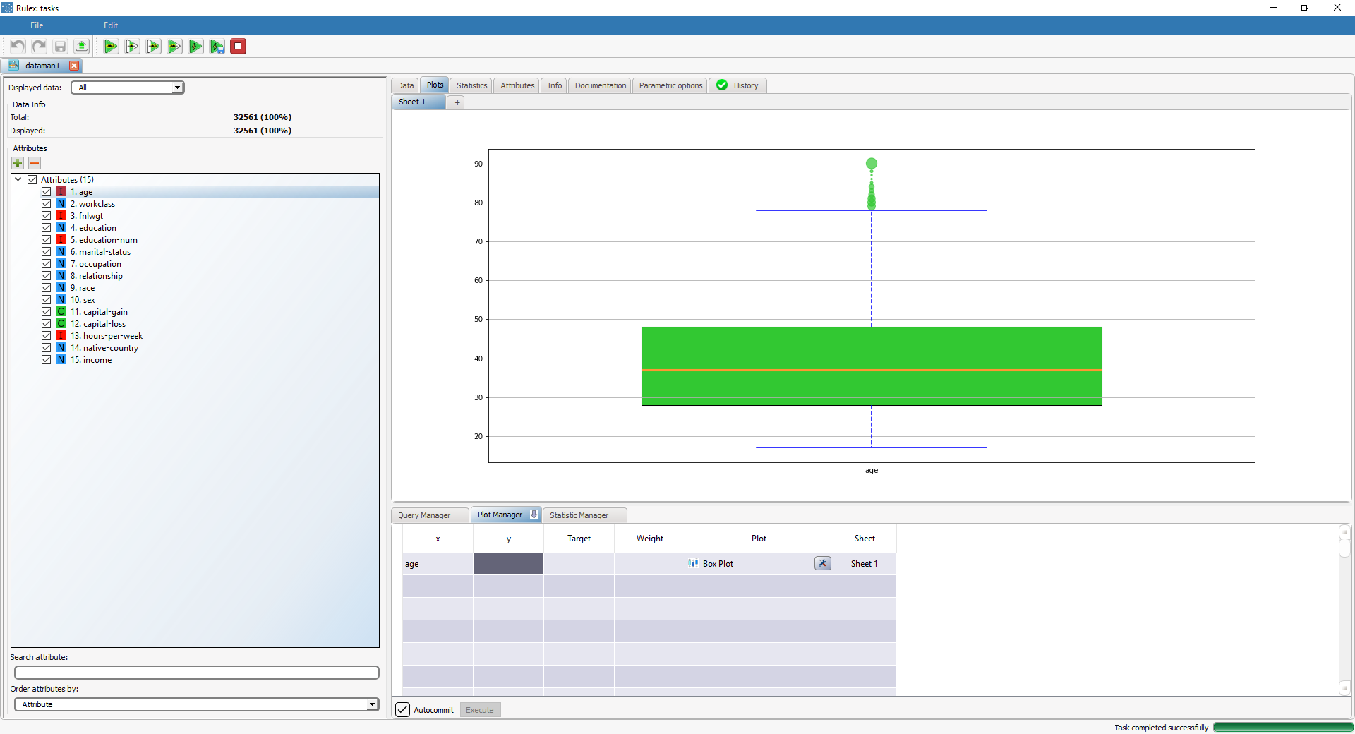
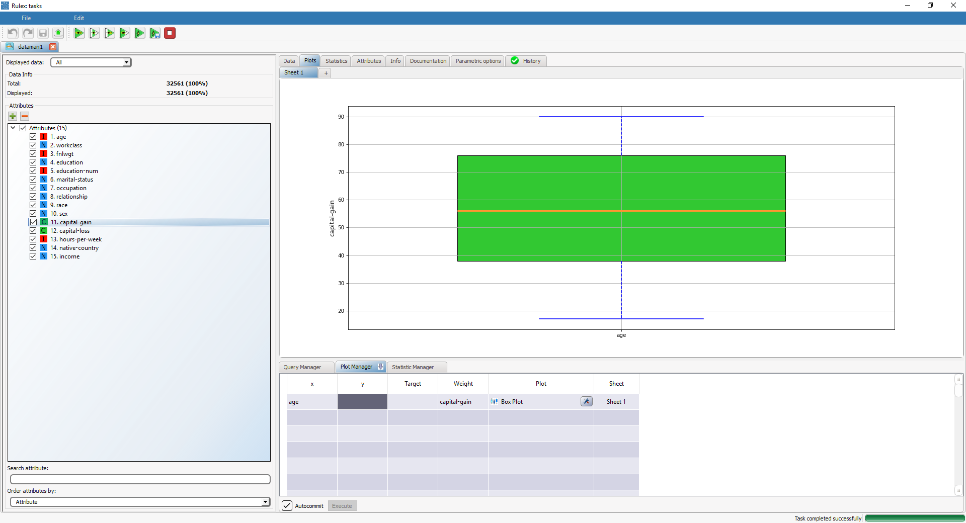
Box plot | Dragging and dropping the age attribute onto the x cell and selecting Box Plot in the Plot cell will display a box plot for the age attribute. The box plot displays the middle values of a variable (included between the first and the third quartile, and the inner line indicates the median), The whiskers stretch to the values corresponding to three times the standard deviation above/below the mean. Any external points are considered outliers and are shown individually. | |
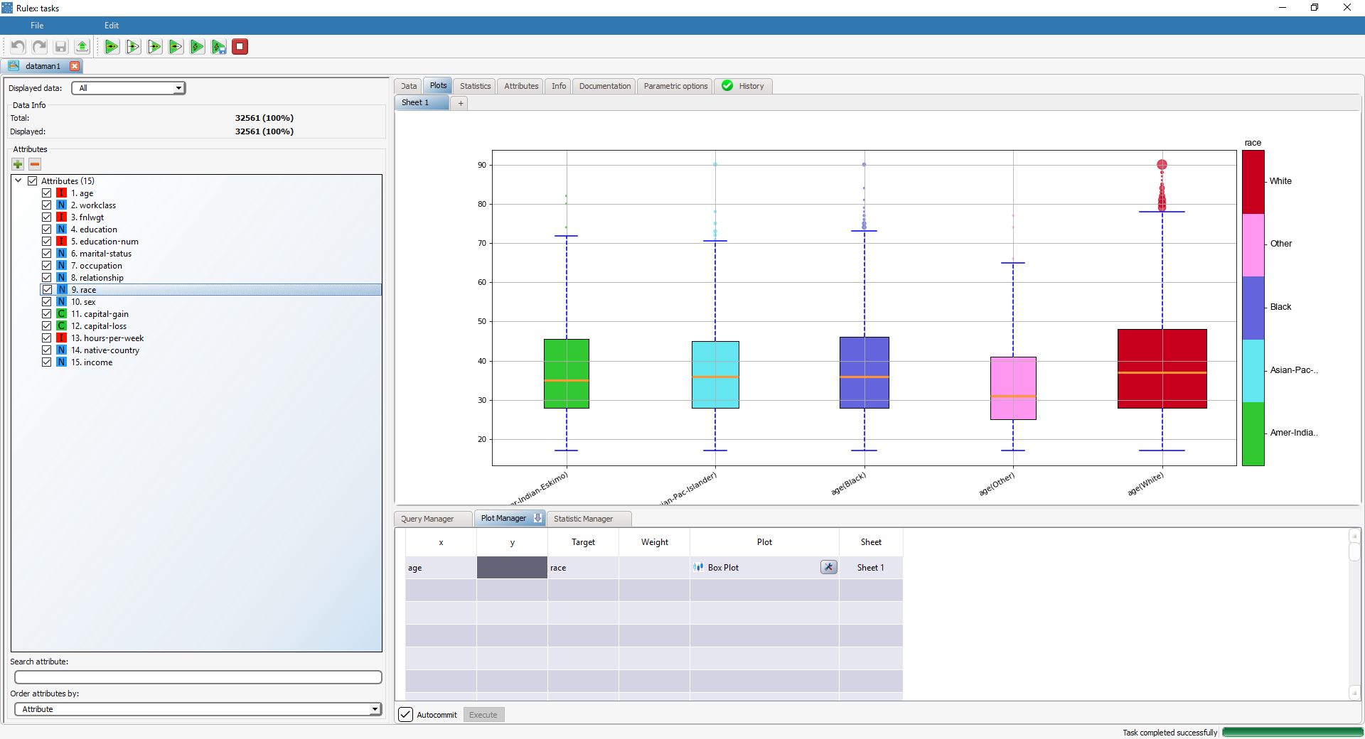
Box plot with target | Dragging and dropping the race attribute onto the Target cell will display the box plots of the age attribute grouped by race. | |
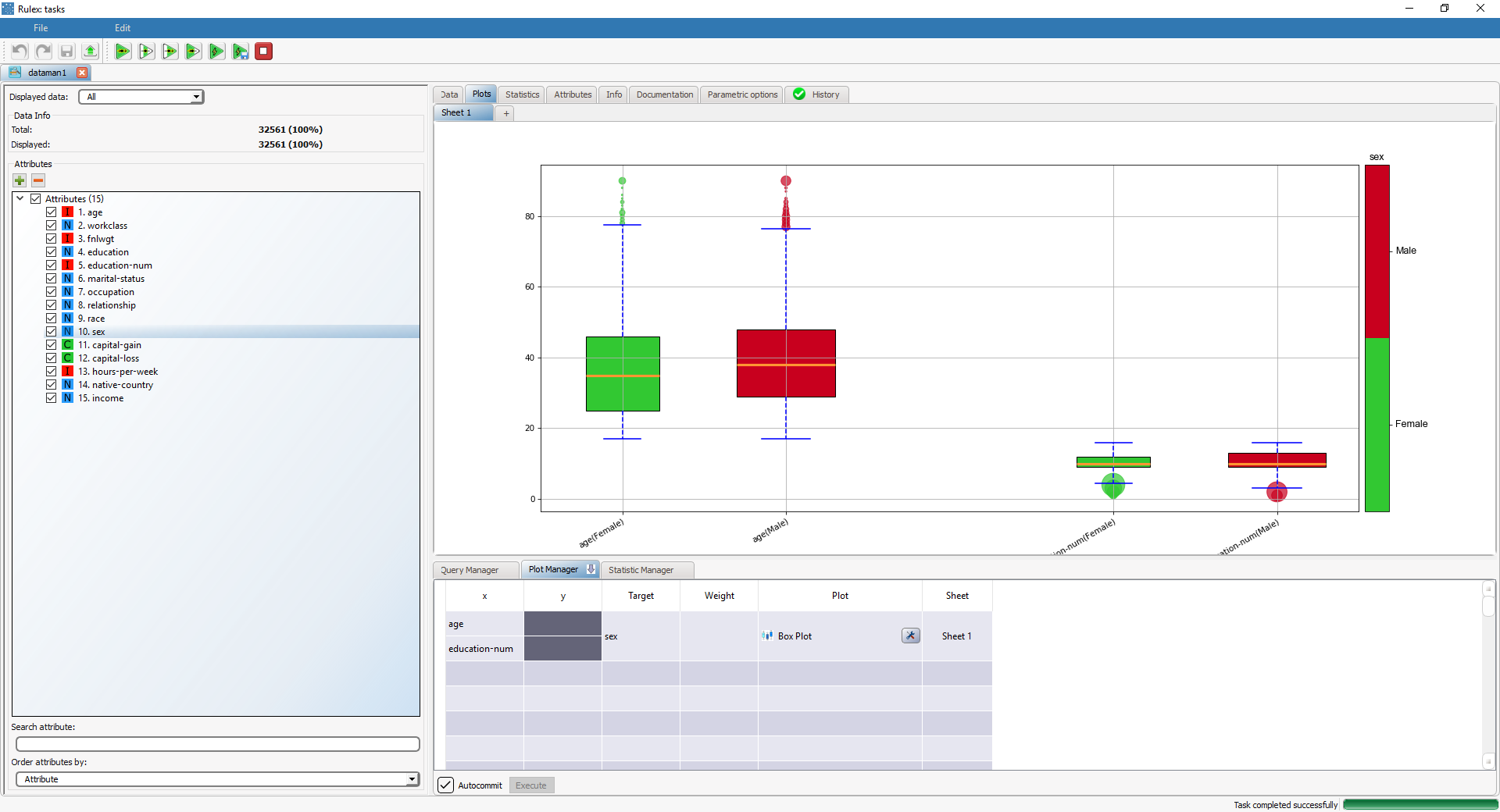
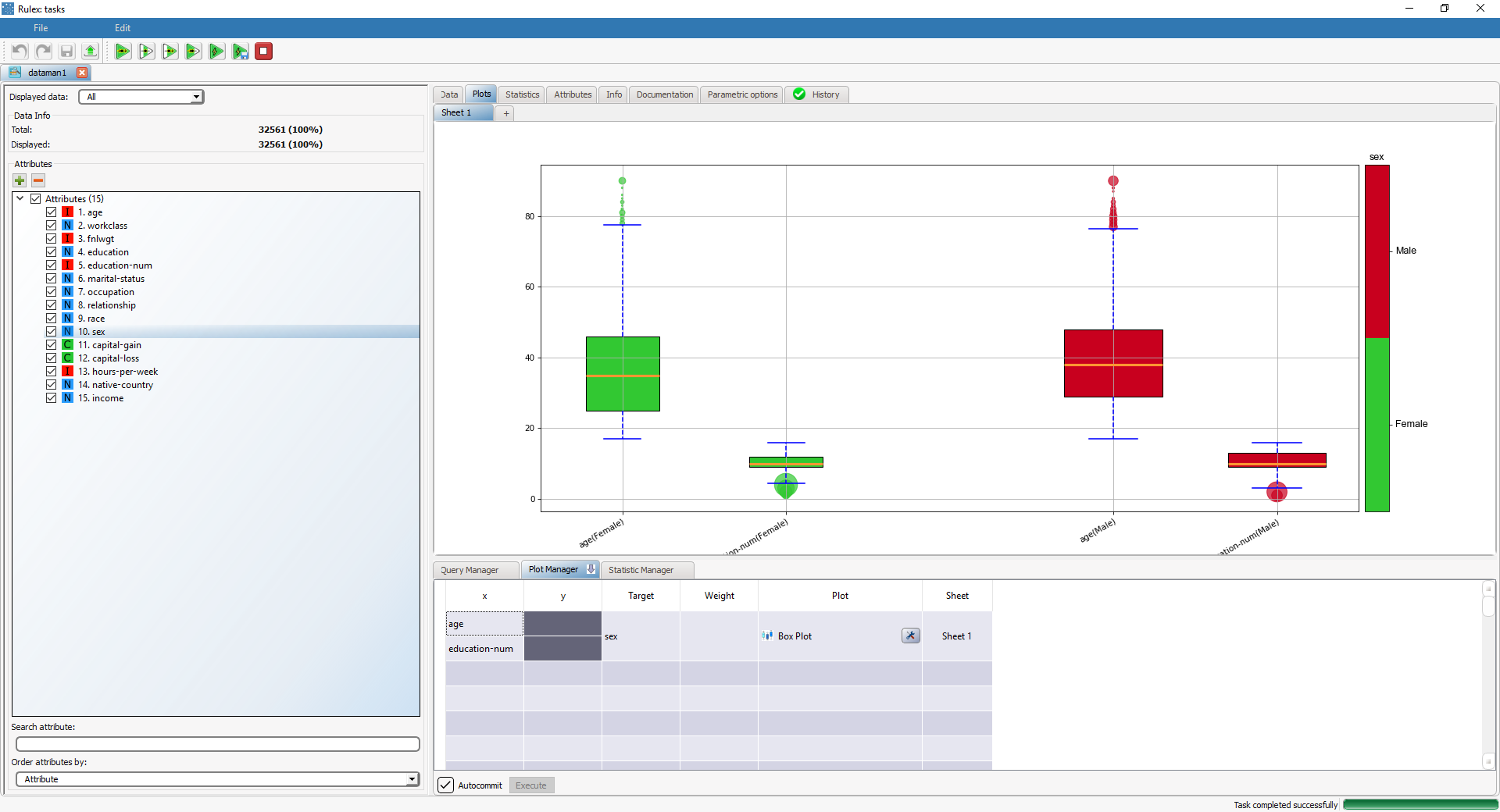
Box plot with target and 2 attributes | If the age and education_num attributes are both used as x attributes (by adding the attributes on separate rows, selecting them, right-clicking and selecting Merge on Box Plot) and sex as the Target attribute, you can decide how to display the results in the Display order attribute. The first table is grouped by target
While the second table is grouped by attribute:
| |
Grouped box plot with weight | Dragging and dropping the capital-gain attribute onto the Weight cell will display the box plot of the age attribute, weight-based on capital-gain. In this case quantiles are computed using the weight variable instead of raw frequencies. |
