Plotting Pie Charts
A Pie Chart is a circular chart divided into sectors, illustrating numerical proportion.
It contains the following attributes:
Attribute | Mandatory | Constraints |
|---|---|---|
x | Yes | |
Weight | No | It cannot be a nominal value |
Properties
Category | Properties | Description |
|---|---|---|
X attribute | Number of bins | Defines the number of displayed intervals for the attributes. Any numerical value is possible. |
Weight attribute | Operator | The operator used to aggregate weight attribute values. Possible values are average, maximum, median, minimum, mode and sum. |
Examples
The following examples are based on the Adult dataset.
Scenario data can be found in the Datasets folder in your Rulex installation.
Type | Description | Result |
|---|---|---|
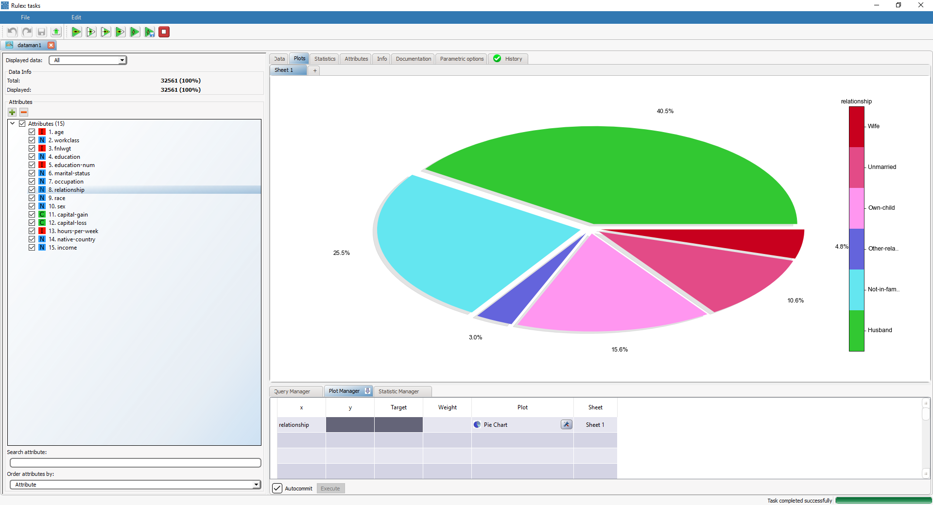
Basic pie chart | Dragging and dropping the relationship attribute onto the x cell and selecting Pie Chart in the Plot cell will display the pie chart of the relationship attribute. | |
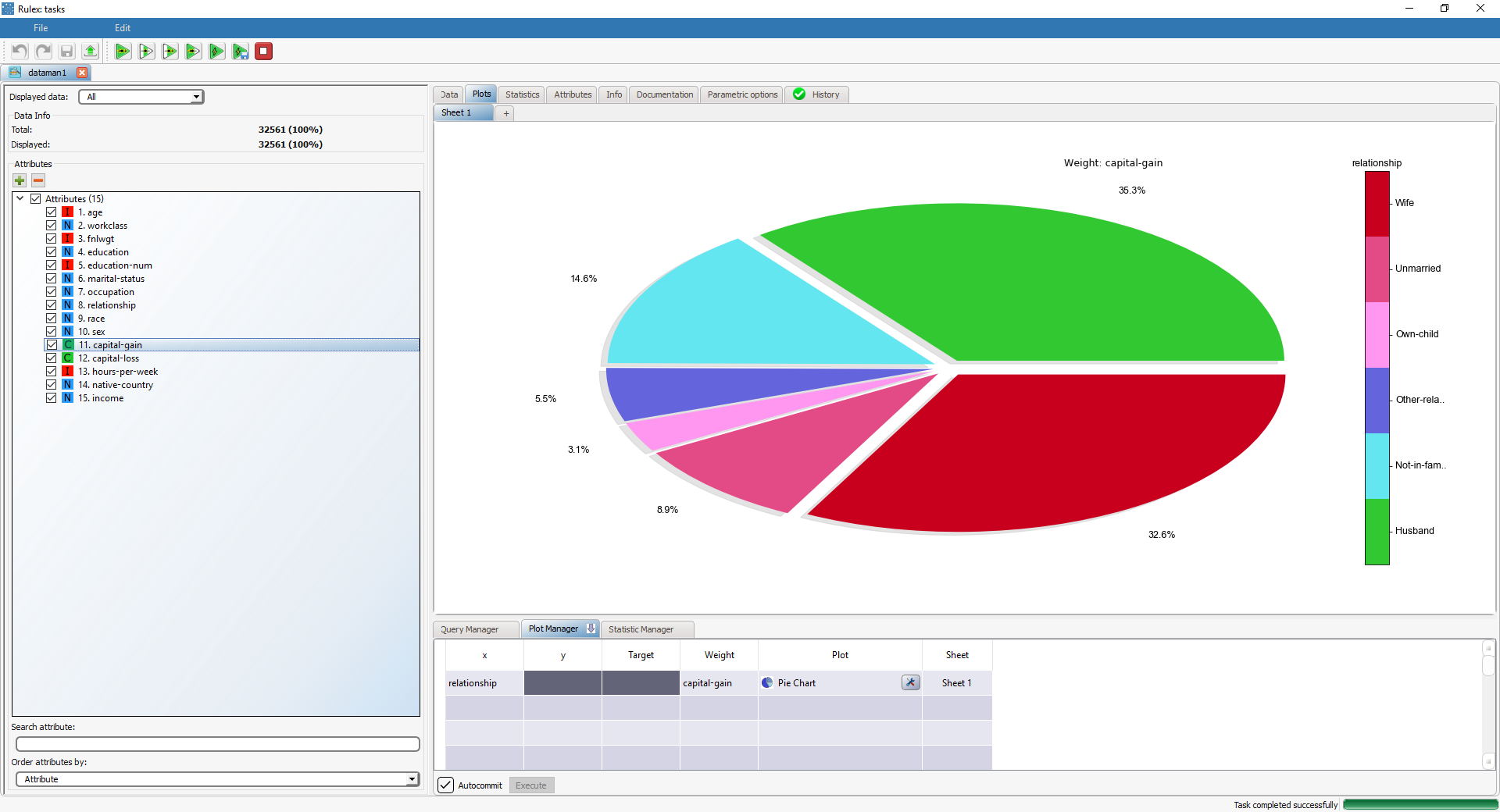
Pie chart with weight | Dragging and dropping the capital-gain attribute onto the Weight cell will display the just built pie chart weight-based on capital-gain attribute values. In this case, the slices of the pie are not drawn based on raw frequencies, but based on the Weight attribute. |

