Plotting Heat Maps
A Heat map is a graphical representation of data where the individual values contained in a matrix are represented as colors.
It contains the following attributes:
Attribute | Mandatory | Constraints |
|---|---|---|
x | Either x or y must be specified | |
y | Either x or y must be specified | |
Weight | No | It cannot be a nominal value |
Properties
Category | Properties | Description |
|---|---|---|
X attribute | Number of region plotted on the x axis | Number of regions plotted on the x axis. |
Y attribute | Number of region plotted on the y axis | Number of regions plotted on the y axis. |
General parameters | Displayed value | The value displayed in the plot. Possible values are standard, total percentage or target percentage. |
Weight attribute | Operator | The operator applied to the values of the Weight attribute. Possible values are average, maximum, median, minimum, mode and sum. |
Examples
The following examples are based on the Adult dataset.
Scenario data can be found in the Datasets folder in your Rulex installation.
Type | Description | Result |
|---|---|---|
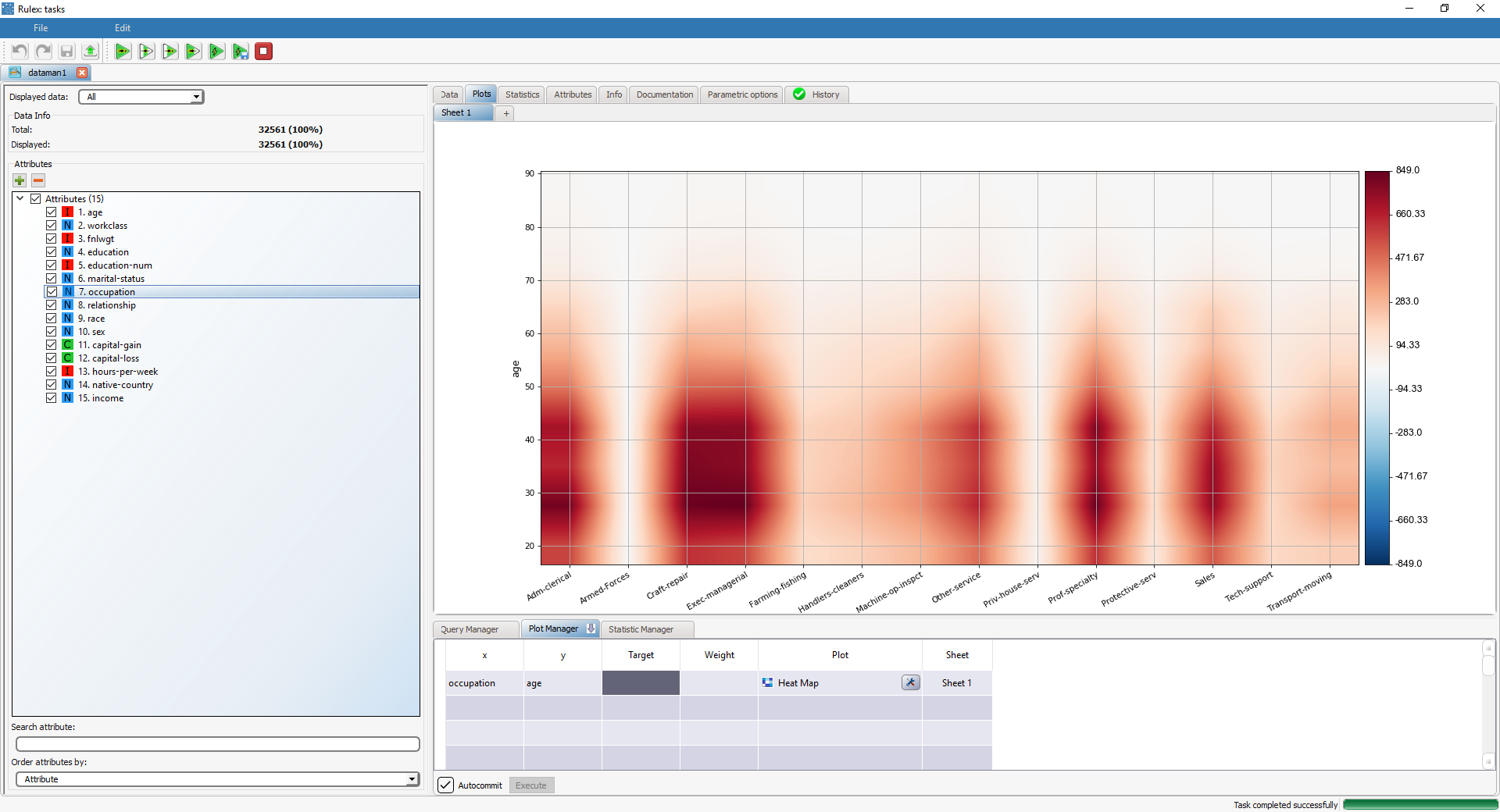
Basic heat map | Dragging and dropping the occupation attribute onto the x cell and the age attribute onto the y cell and selecting Heat Map in the Plot cell will display a heat map associated to these two variables. | |
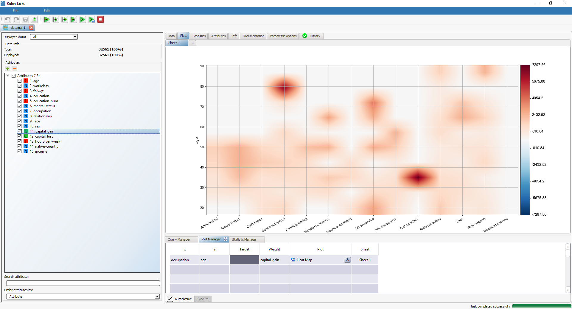
Heat map with weight | Dragging and dropping the capital-gain attribute onto the Weight cell will display the just built heat map weight-based on capital-gain values. In this case, the heat map is not built based on raw frequencies, but on the Weight attribute. |

