Plotting ROC Curves
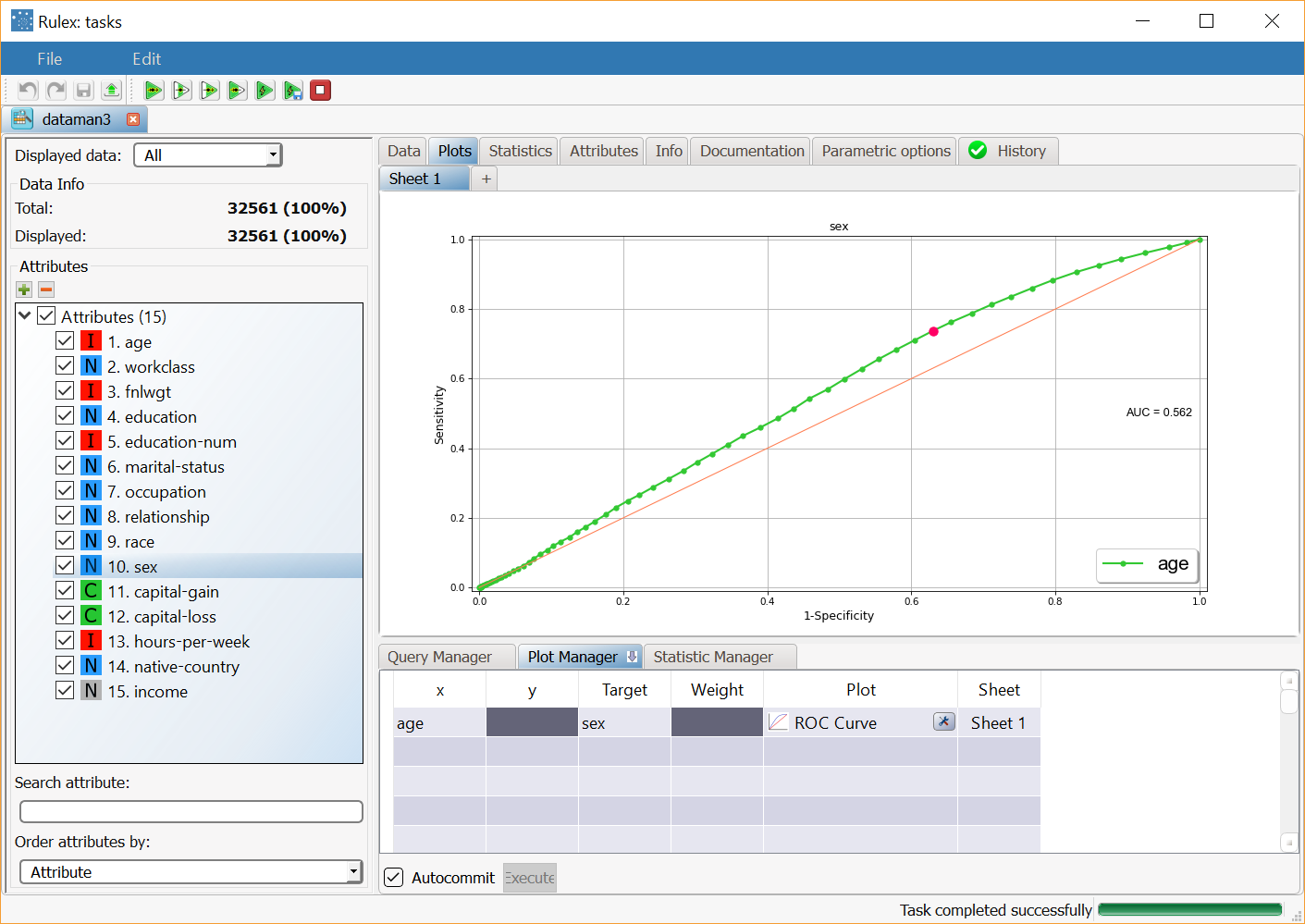
A Receiver Operating Characteristic (ROC) Curve is a graphical plot which illustrates the performance of a binary classifier system as its discrimination threshold is varied. The ROC curve is a fundamental tool for diagnostic test evaluation. In a ROC curve the true positive rate (Sensitivity) is plotted in function of the false positive rate (1-Specificity) for different cut-off points of a parameter. Each point on the ROC curve represents a sensitivity/specificity pair corresponding to a particular decision threshold.
The area under the ROC curve is a measure of how well a parameter can distinguish between two groups (e.g. diseased/normal). Is it possible to selected the values of the target attribute to define the classification.
It contains the following attributes:
Attribute | Mandatory | Constraints |
|---|---|---|
x | Yes | It cannot be a nominal value |
Target | Yes |
Properties
Category | Properties | Description |
|---|---|---|
General parameters | Positive test for: | Indicates the direction in which the comparison will be performed. Possible values are greater values, lower values or automatic selection. |
Parameters | Use target attribute | If selected, you can define the reference values for the target to be used to compute the ROC curve. |
Examples
The following example is based on the Adult dataset.
Scenario data can be found in the Datasets folder in your Rulex installation.
Description | Result |
|---|---|
Dragging and dropping the age attribute onto an x cell and the sex attribute onto the Target cell, and selecting ROC curve in the Plot cell will display the ROC curve of the age attribute classified by the values of the sex attribute. |
