Plotting Grouped Bar Plots
A grouped bar plot or histogram is made up of rectangular bars, whose length is proportional to the values they represent. If a target is defined, bars with a different color for each value of the target are plotted.
It contains the following attributes:
Attribute | Mandatory | Constraints |
|---|---|---|
x | Ether x or y must be specified | |
y | Either x or y must be specified | It cannot be a nominal value |
target | No |
Properties
Category | Properties | Description |
|---|---|---|
General | Fitting curve | If Normal Distribution is selected, the Gaussian curve that best fits the data distribution is drawn. Continuous attributes only. |
Show null values | If selected, missing values are displayed. | |
Reverse order | If selected, the order of values in the x axis is reversed. By default the order is a-z; if selected the order becomes z-a. Nominal attributes only. | |
Sort by value | If selected bars are sorted according to their height (i.e. the y value). Nominal attributes only. | |
Orientation | Displays the bars vertically or horizontally. | |
Displayed value | Select which value should be plotted from the following possibilities:
For example, if x has three values: a, b and c and the average (or sum, mode etc., according to the selected aggregation operator) of y is 5 for a,10 for b and 20 for c. If Standard is selected as the Displayed Value the height of the three bars is 5, 10 and 20. If Total Percentage is selected the percentage is displayed. As the sum is 35, the three bars will have the following heights: 100*5/(35), 100*10/(35), 100*20/(35). | |
X attribute | Number of bins | Defines the number of displayed intervals for the x attribute. |
Target attribute | Number of bins | Defines the number of displayed intervals for the target attribute. |
Y attribute | Aggregate operator | The operator required to aggregate data. This is used to determine the height of the bars according to the option selected in Displayed value. Possible values are average, maximum, median, minimum, mode and sum. |
Examples
The following examples are based on the Adult dataset.
Scenario data can be found in the Datasets folder in your Rulex installation.
Type | Description | Result |
|---|---|---|
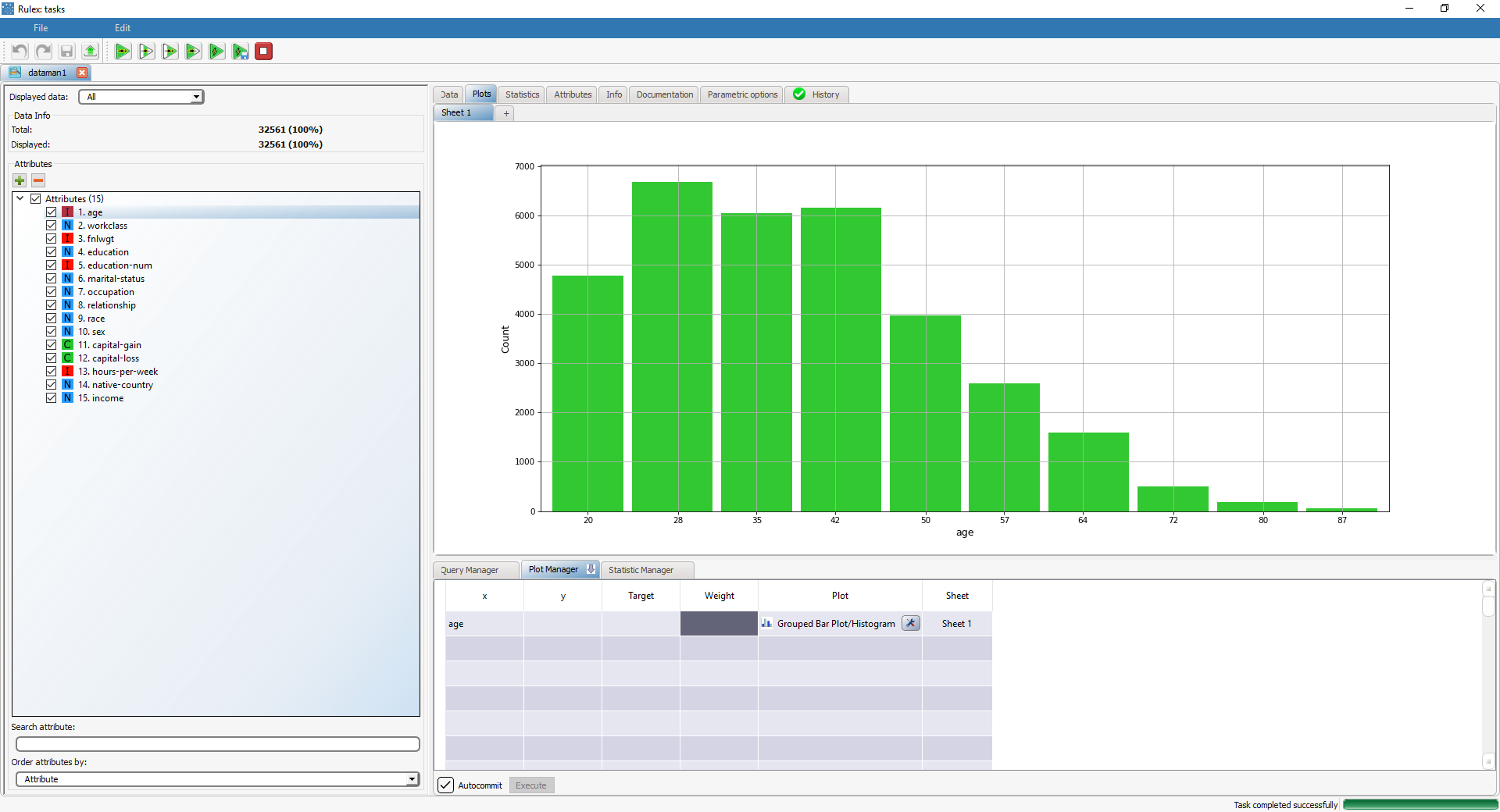
Basic grouped bar plot | Setting the attribute age attribute in the x cell will display a 10-bin histogram based on age. In this case, the height of each bar corresponds to the number of occurrences for each value. | |
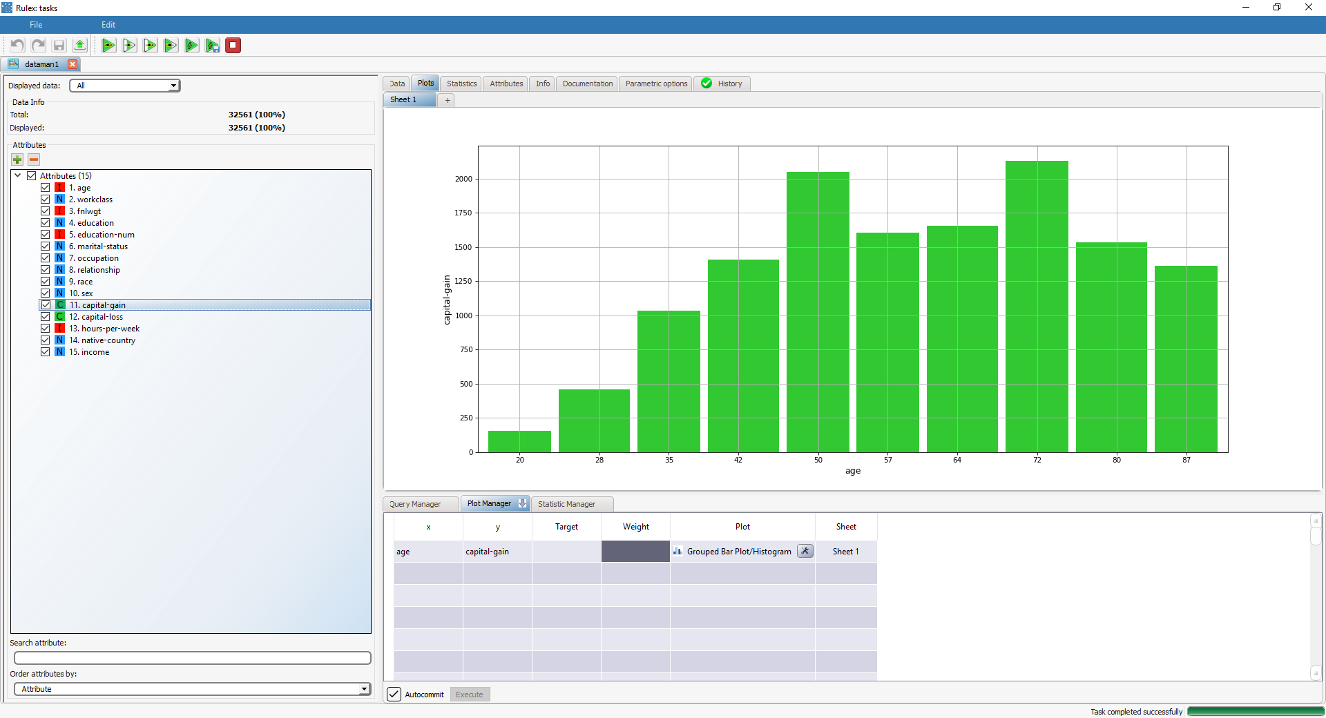
Grouped bar plot with weight | Adding the capital-gain attribute to the y cell will display the age histogram, weight-based on capital-gain values. The height of each bar is is the average of the capital-gain (or the sum, maximum etc. according to the specified Aggregate operator). | |
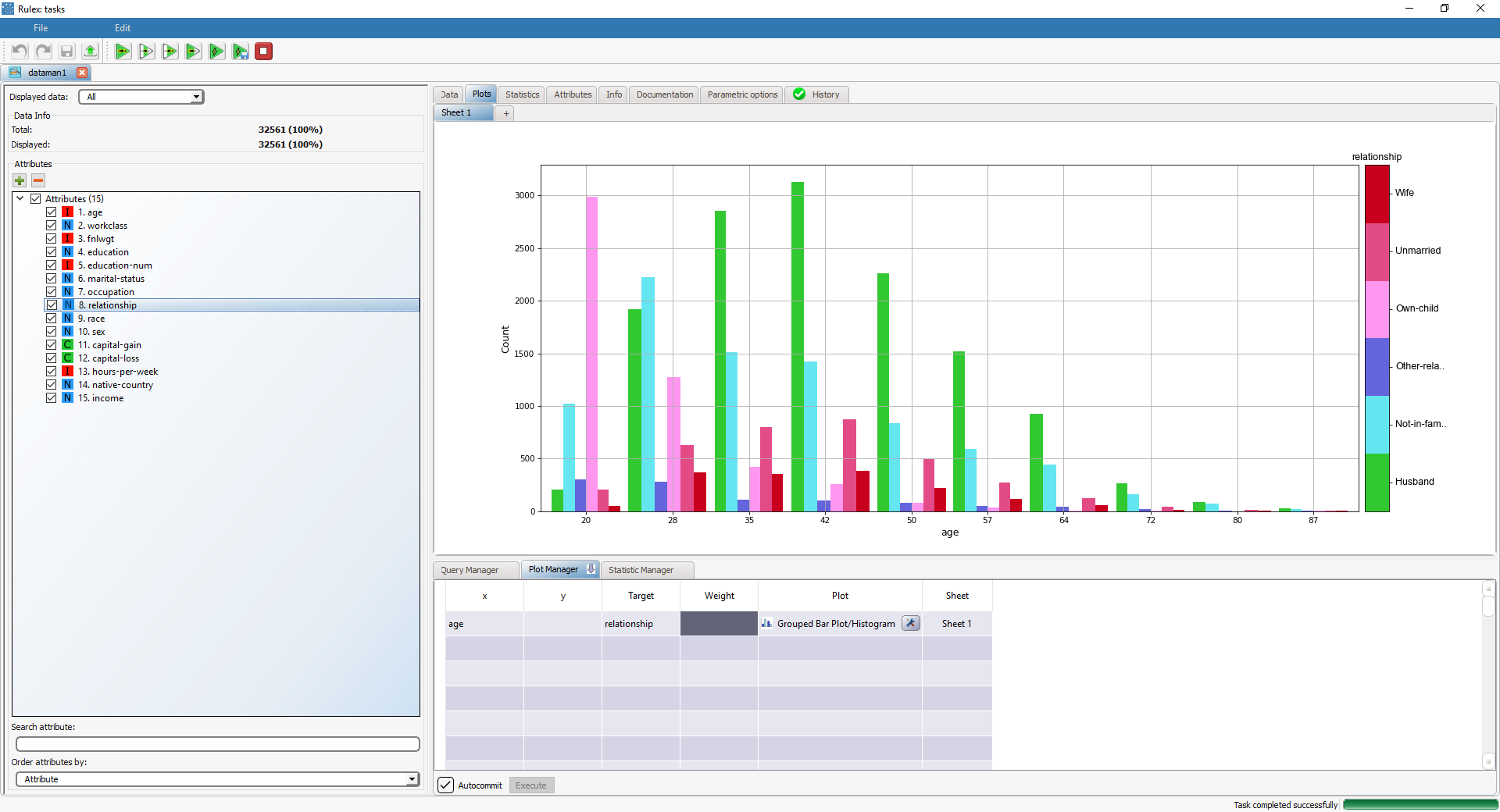
Grouped bar plot with target | Adding the relationship attribute to the Target cell will display the distribution of relationship classes in the previous histogram, in different colors. |


